
Student Presentations
Assignments 2.1 & 2.2 development
Continue to develop the Vicinity and 3D Analytical diagrams
- Make a two lists of discussion/feedback/critique items about your Vicinity and 3D Analytical diagrams.
- Make a third list, no visuals, with a minimum of four project design opportunities, challenges, and concerns that could be addressed further than you currently show. Try to be specific. Some possibilities include:
- PROGRAMMATIC – My lounge idea could be affected by the wind, so I should show the direction(s) and strength on the 3D diagram to communicate this challenge
- SPATIAL – I want sunlight to come into the lobby, so I need to show on my 3D diagram the directions that I need to have openings
- SEASONAL – I want to have a cool shade structure in the pool area, but it might need to change location throughout the year as my 3D analysis shows
- ACCESS – I plan to have special events in the pool area during the summer, so Ubers are going to queue for drop-off and pick-up; this could be a problem for regular hotel guests to check in/out easily during the events. How can I show this on the 3D analysis as a problem to be solved?
- PROXIMITY – How can I show on my Vicinity diagram the challenges of taking advantage of my brand’s partnerships with businesses across town, while also demonstrating my brand’s support of carbon-zero transportation?
- SEASONAL – The view from the roof is great — except at this time of year in this direction because of the smog as I show on the 3D analysis
- SPATIAL – You can see the Hollywood sign from the roof — but there is tall building that blocks it from this corner as my 3D analysis shows
- many other types of opportunities and challenges
- Place a draft of the three lists in the same space where you pinned up this Week 3 before the end of class time Week 3.
- Add labels and flags to the diagrams as appropriate.
- Make sure your 3d Analytical diagram has a north arrow.
Assignment 3.1
Narrative concept diagram of your ENV-3 project
Create a concept diagram that describes your project as a narrative. This should be a short series of individual graphics that also shows relationships between them.
What is the concept that each individual graphic embodies? What are the relationships between them? What form is the overall narrative – linear, circular, multi-threaded?
Apply the tools from Design is Storytelling, what we did for the Lego House exercise, and the examples shown in class. This should be about communicating your concept for the experience and design story.
Pinup a 1920×1080 color PDF on Bluescape.
Assignment 3.2
Spatial concept diagram of your ENV-3 project
Create a simple, cohesive diagram or small set of diagrams to describe the spatial aspects of your ENV-3 project. How can the tools from Design is Storytelling be applied for this purpose? What is the concept related to each of your spaces?
Pinup a 1920×1080 color PDF on Bluescape.
Assignment 3.3
World Cup Prediction Tracing
Make as much progress as you can on the tracing.
Pinup a 1920×1080 color PDF on Bluescape.
01 Mapping Time
Download the slide from the class’ Week 4 Google Drive folder.
Statistics
Art Center Library Online Resources
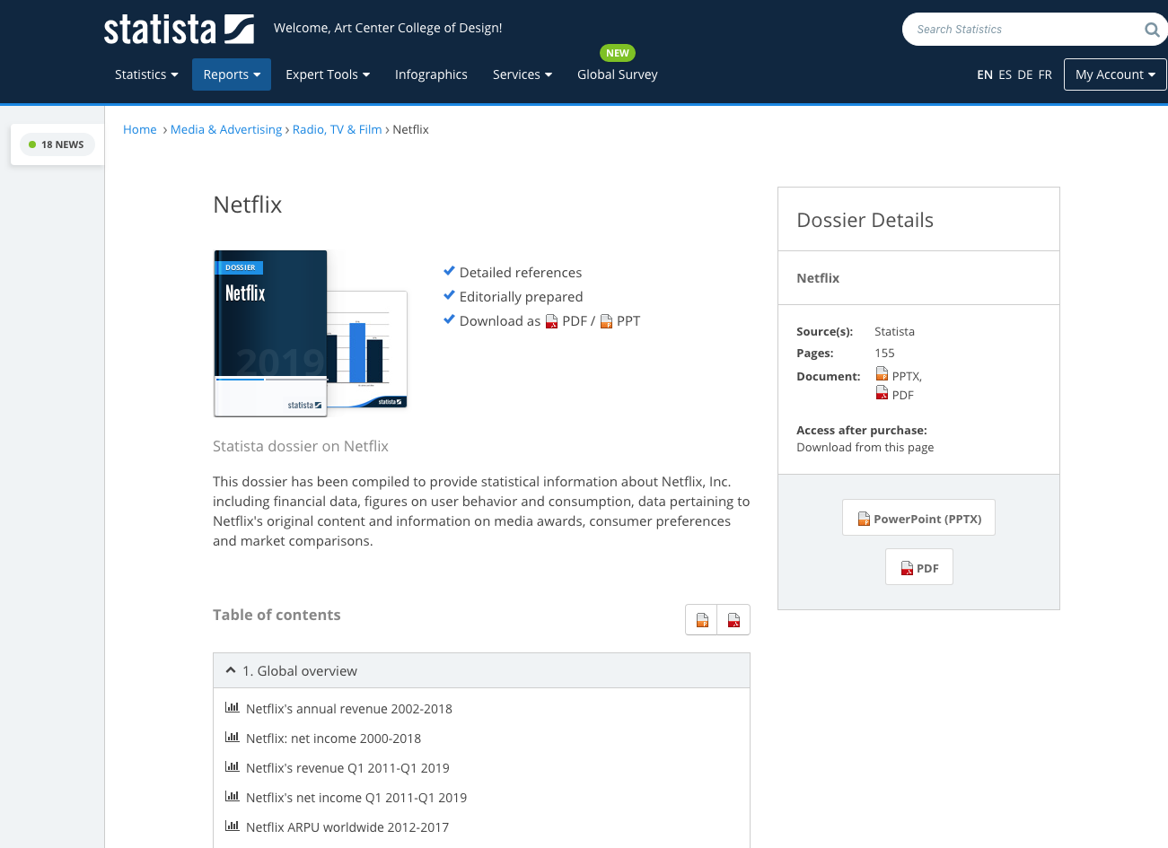
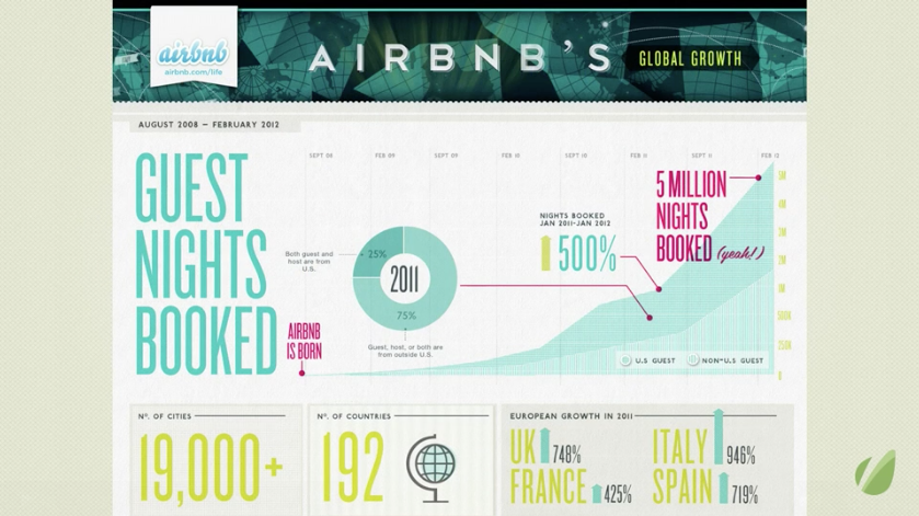
Search on Statista for
- Airbnb
- Uber or Lyft
- Netflix
The Statista “dossier” is a useful compilation of information.
Discussion session
- How to map concept of time?
- Time as linear concept or non linear concept?
- X-Axis = time
- Y-Axis = quantifiable number
- Insert important events with pictograms and flags
- How do different datasets relate? Does one affect another (and another…)?
02 Illustrator tutorial 02
Download the AI file from the Google Drive to follow along: DL03_W03_AI_Elements.ai
- Different types of flags
- Quantifying objects
- Scale with scale factor
- Relationships
- Friendly / Hostile / Frenemy
- Linear timeline
- Representing time
- Using the Align palette and Rotation tools to create guides. Using them to organize information.
03 LAB session – Assignment 4.1 (see below for details)
- Layout basic timeline
- Sketch out events
Here’s a YouTube tutorial on using the Illustrator pen tool
Assignment 4.1
Mapping time (2160×1920 color PDF)
- Go to Statista or any other statistical information source and find quantifiable, time-based data for a specific company.
- Find 3-5 datasets that are related by time.
- Create a time diagram based on the information. Do not copy and paste diagrams that you find. Translate the data into your own graphics.
- Synthesize the data – put them together into a single, cohesive large-format graphic that clearly reveals relationships and correlations between the datasets.
- The graphic should explain what triggered major changes in numbers – milestone events.
- Hypothetical example for Apple, Inc.:
- Dataset 1 = Timeline of annual revenue
- Dataset 2 = Timeline of product introductions
- Overlay the data to show that the introductions of the iPod and iPad correlated with spikes in revenue.
- Be precise about numbers and use proportional representation of quantities.
- The important question is: by mapping this instance, what are you trying to reveal?
Assignment 4.2
Tracing Diagram (1920×1080 color PDF)
If you have not made much progress tracing the World Cup Prediction, complete that for Assignment 4.2.
If you were able to complete the World Cup Prediction tracing, choose a new, appropriate (meaning approved by the instructor) graphic, and trace it in Adobe Illustrator exactly the same way. Some sources:
-
- Information Graphics book
- from searching for “information graphics” on the web.
- Nicholas Felton’s work
- Valerio Pellegrini’s work
- Paul Button’s work: link 1 / link 2
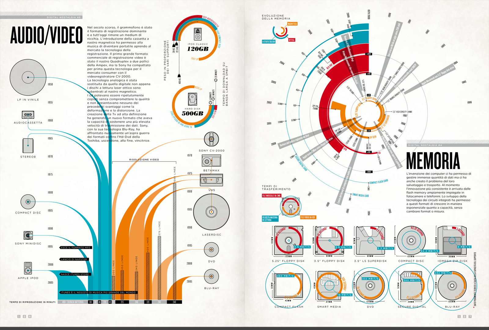
Upload your 1920×1080 color PDF to the class Google Drive along with a screen capture/download of the original graphic.
Assignments 2.1 & 2.2 development
Continue progress on the Site Diagrams (2D Locating and 3D Analytical)